
Methodology
30 minutes per participant
London, remote
Usability Study
Users were asked to perform task in a low-fidelity prototype


Project Background
We are creating an App to help people to be more connected with art work. We want to show art more interactive, accessible and fun to users. We need to find out if the main user experience, finding and scheduling a Virtual Tour, is interactive and easy for the users to complete.

Research Questions
How long does it take to users to find the content they are looking for?
How many users use AR or VR?
How many user register them selfs and get an annual subscription?
Does content reach users expectations?
Is any change we can make to improve accessibility
_next steps
Users need an App with good quality art content, interactive and easy to use. All our users would like to see content for all over the globe. It will we good to have a globe map where users can interact clicking and searching by country


Appart is a virtual gallery focused on independent artists based in London where many established artists show their works to and eclipse of new talent. Appart offers a virtual window in a showcase where galleries, curators and spectators can enjoy and interact with virtual tours, art openings, interviews with artists from around the globe.
Appart
By Creatives, for Creatives
I conducted UX research to add context and insights to the design processes. Creating Personas, empathy maps to understand the users needs. At the primary user group identified through research was art students, art professionals, artist and professionals interested on art who don’t have the right platform to enjoy the content as they would like.
This group confirmed about the positive path with Appart, but research also revelled that time or money wasn’t the only factor limiting users to enjoy art. Other user problems included the lack of international content, pour interactivity, accessibility and not virtual tours.
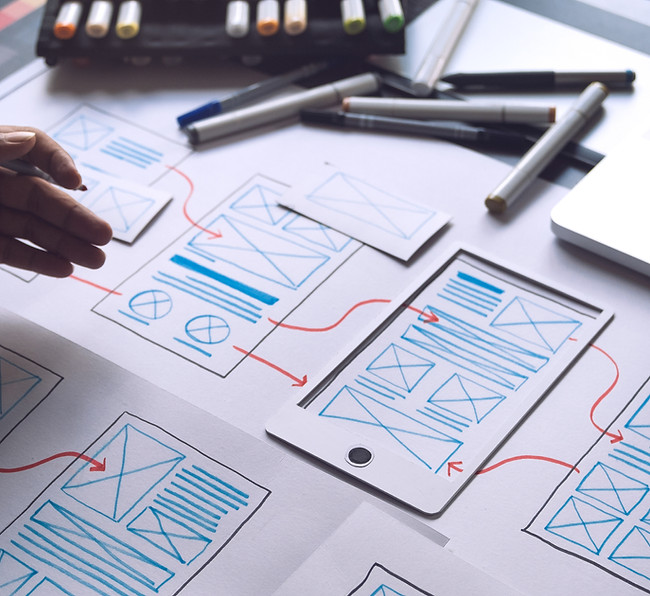
Paper wireframes

At first I draw some drafts iterations of Appart to identify with elements users will need. After that, I draft iterations off each screen app on paper to ensure that the elements that made it to digital wireframe would be situated to agrees user pain points. For the home screen, I prioritize having all gallery content at first glance to help users save
time.


My role:
Ux designer designing an app for Appart from conception to delivery
Responsibilities:
Conducting interviews, find users’ pain points, paper and digital wireframing, low and high-fidelity prototyping, conducting usability studies-testing, accounting for accessibility, and integrating on designs.
As initial design phase continued, I made sure to base screen design on feedback and findings from the users research.
The design has upgrade to to be more clear, interactive and minimalistic.
Digital wireframes
Easy access to themes was a key user need to have complete control of their exhibitions and tours there would like to see. Menu and search access button pinned to the bottom of the screen app to be more accessible and work with assistive technologies.
Artist lack affordable spaces to exhibit their work.
Design an affordable art community where artist can display their projects.
Gallery is not able show in the gallery all the content they have.
Design a virtual tour app for an art gallery where the gallery can expand and bring together independent artist from all over the wold.
Students and professionals with hunger of see more art from independent artist around the wold.
Design an app where users can enjoy art content from around the globe.
Project overview
The problem - The goal


-
Mockups
Persona
Products
Designed
For
You


Early designs allowed for some customization, but after the usability studies, I changed the all design to look more clear and minimalistic. I also move the menu, search, account and add What’s on to the button of the page for more accessibility. At the top of the page I add a scrolling options like THEME - ARTIST - COUNTRY.


Users want to have access to virtual tours including AR
Users want to discover more independent artist
Users want new experiences on the way to see art


Users want to sync with other calendars
No “Delete” button or option on My Account for next tour opening
Map scrolling-zoom needs more interaction
Round 1 findings
Round 2 findings
GATHER, ORGANIZE, AND REFLECT ON DATA
Usability study


Low-fidelity prototype
Using the completed set of digital wireframes, I created a low-fidelity prototype. The primary user flow I connected was AR view and themes screen, so the prototype could be used in a usability study.
View the Appar’s Gallery


High-fidelity
prototype
The final high-fidelity prototype presented cleaner user flows searching, payments, viewing, add to my account, add calendar, interacting between projects, AR available.
View the Appart’s app
